Workflow sheet
Breakpoints: The Model Matters More Than the Numbers
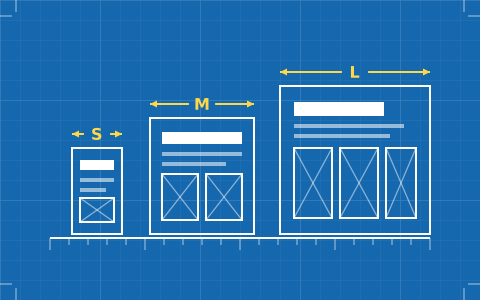
Arguing about whether the tablet breakpoint is 768 or 810 misses the question. What decides your week is whether the tool cascades, and whether you designed a base to cascade from.
- Issued
- 06 SEPT 2026
- Last verified
- 19 SEPT 2026
- Reading
- 5 min
- Type
- Guide
Responsive breakpoints are where a designer's artboard habits meet the web's actual model, and the collision is usually expensive. The argument that occupies most of the time — which pixel values to use — is the least important part. What determines whether a build goes smoothly is the tool's breakpoint model, and whether the design you handed it has a base layer at all.
There are two models in this category. Some tools cascade: a style set at one width flows to the widths below unless overridden. Others treat each breakpoint as an independent canvas. The first is CSS's own model and it is the one that scales; the second feels more like a design tool and produces four times the maintenance.
The cascading model, and why it wins
In a cascading system there is a base. You style once, at the base, and then make targeted overrides at specific widths for the cases that genuinely need to differ. Most of your styles exist in exactly one place, which means most of your future edits happen in exactly one place.
Webflow implements this directly: styles set on the desktop base flow downward to narrower breakpoints, with larger-screen breakpoints available above. The consequence designers feel immediately is that a tidy build has very few overrides — and a build with an override at every breakpoint for every element is a signal that the base is wrong rather than that the site is complicated.
Framer expresses the same principle through sizing behaviour rather than through a cascade of declarations. Fill, hug and fixed on well-built stacks mean a large proportion of layouts need no breakpoint work at all, which is arguably the cleanest version of the idea: the layout adapts because it was described relationally, not because you drew it again at a second width.
The independent-canvas model, and its tax
Some editors let you arrange each breakpoint freely, with changes at one width not affecting another. This feels wonderful for about a day, because it is exactly how a design tool behaves and there are no surprising side effects.
The tax arrives on the first content change. A new paragraph, a longer headline, a swapped image — each has to be handled at every width, because the widths do not know about each other. Multiply by the number of edits a site receives over two years and the model has cost more than the entire build.
If you are working in a tool like this, the mitigation is to be unusually disciplined about components: build once, use everywhere, and make changes at the component level so the per-breakpoint work happens in one definition rather than on every page.
Design a base, not three artboards
This is the habit that causes the most rework, and it happens in Figma long before anyone opens a builder. If you hand over a 1,440-pixel artboard and a 375-pixel artboard, you have described two destinations and no journey. The builder has no base to inherit from, so everything becomes an override.
Designing the narrow case first fixes this almost entirely. It forces the hierarchy decisions early — what has to be visible, what can collapse, what order things go in when there is no room for cleverness — and those decisions are the substance of a responsive design. Widening a considered narrow layout is pleasant work. Narrowing a desktop composition is triage.
It also produces better desktop layouts, because a design that survived 375 pixels has already justified every element it contains.
Choose breakpoints from the content
Device-derived breakpoints were always a fiction and are now an obsolete one; there is no tablet width, there is a continuum. The useful method is to widen the browser slowly from narrow and add a breakpoint wherever the layout stops looking right — which is a measurement of your design rather than of the market.
Done this way most sites need three breakpoints and some need two. Type is usually the first thing to break, because a line length that reads well at 390 pixels becomes an unreadable 110-character measure at 900 long before any grid needs rearranging.
The corollary is that fluid techniques remove breakpoints entirely. Type that scales smoothly between a minimum and a maximum, and grids that reflow by available space rather than by declared width, solve at the property level what breakpoints solve at the layout level — and both major tools support enough of this to be worth using.
Testing that actually finds problems
Dragging the browser window is the fastest and most honest test, and the one most often skipped in favour of preset device sizes. Presets show you the widths you already designed for; dragging shows you the widths between them, which is where every layout failure actually lives.
Test with real content while you are there, and specifically with the longest plausible content. Lorem ipsum is uniformly sized in a way real language never is, and half of all responsive bugs are a proper noun nobody anticipated.
Check one more thing that almost nobody checks: what happens at very large widths. A layout with no maximum will happily stretch a paragraph to 200 characters on an ultrawide display, and that is a real reader having a bad time.
The four places layouts actually break
Long navigation is the first. A menu with six items and a button fits at 1,200 pixels and does not fit at 900, and the decision about what happens in between — collapse to a menu, wrap to two lines, drop the button — is a design decision that nobody makes until the layout has already broken.
Tables are the second, and they are the one that most often ships broken. A table with five columns cannot be made narrow; it can only be scrolled, restructured into cards, or have columns hidden. Picking which of those three happens is design work, and leaving it to the browser means horizontal scrolling on the whole page rather than on the table.
Third is anything with a fixed aspect ratio next to anything without one — a video beside a caption, an image beside a paragraph. The two elements want different things as the space narrows, and the point where they disagree is usually well inside the range between your artboards.
Fourth is your own hero. Large display type set at a size that works on a wide screen will break to four or five ragged lines at 390 pixels, and a headline is the one element where that is immediately visible to everyone. Fluid type sizing solves it more elegantly than a breakpoint does.
What this means for the tool choice
Weight the breakpoint model heavily if the site will be edited often, and lightly if it is a campaign page with a short life. Webflow's cascade is the most conventional and the most predictable for anyone with CSS instincts; Framer's relational sizing removes much of the need for breakpoints in the first place. Both are good answers and they are different answers.
The rest of the comparison, including what each tool costs and what you can take away from it, is on the best website builders for designers. For how the same structural thinking applies to the file you start from, see the sheet on design fidelity.
See alsoWhere this tool lands against the rest of the set: the best website builders for designers.